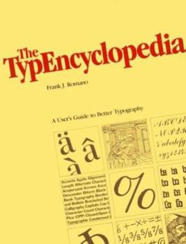
The Typencyclopedia: A User's Guide to Better Typography (The Bowker Graphics Library. Bowker's Composition Series)
Select Format
Select Condition 
Book Overview
No Synopsis Available.
Format:Paperback
Language:English
ISBN:0835219259
ISBN13:9780835219259
Release Date:January 1984
Publisher:Libraries Unltd Inc
Length:188 Pages
Weight:1.50 lbs.
Dimensions:10.8" x 0.5" x 8.5"
Customer Reviews
1 rating
Good Type Casting
Published by Thriftbooks.com User , 24 years ago
"Bad break" is one of the many keywords alphabetically arranged with diagrams and examples in THE TYPENCYCLOPEDIA: A USER'S GUIDE TO BETTER TYPOGRAPHY. Frank J. Romano also includes math symbols and proof marks and ends with current typeface names crosslisted to other manufacturers' designs and with a full index of terms. He gives a mission statement for typography as readable text with consistent word spacing, frequent paragraphs, narrower line lengths and well-designed typefaces on a page with enough white space for non-type gutters, leading, margins, and space around heads and illustrations.The author throws in good typographical small talk, such as letting us know that Aldus Manutius was one of the first printers to punctuate text. He puts in humorous comments, too, such as saying that the art department is low on work when graphic designers put together character or word pictures to create, for example, that famous image of President Lincoln's face. Finally, he sets good typographic standards, such as avoiding back slanting type because it goes against reading flow; making quotes a size smaller than text; restricting vertical setting to a short line with otherwise horizontal type and vertical stacking to printing down book backbones; and using evocative typography and special effects in moderation. All this and more make for easy reviewing of typography as well as good reading along with Lewis Blackwell's TWENTIETH CENTURY TYPE REMIX, Robert Bringhurst's THE ELEMENTS OF TYPOGRAPHIC STYLE, and Jan Tschichold's TREASURY OF ALPHABETS AND LETTERING.


