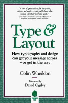
Type and Layout
Select Format
Select Condition 
Book Overview
"A surprising and useful book full of information and indispensable to anyone involved in communicating ideas through typographic means".--Milton Glaser, president, Milton Glaser, Inc". TYPE and... This description may be from another edition of this product.
Format:Paperback
Language:English
ISBN:0962489158
ISBN13:9780962489150
Release Date:January 1995
Publisher:Strathmoor Press
Length:248 Pages
Weight:1.10 lbs.
Dimensions:0.9" x 6.0" x 8.8"
Customer Reviews
5 ratings
Unparalled Research Into Legibility
Published by Thriftbooks.com User , 20 years ago
Wheildon refocuses the question of legibility onto how much the reader remembers. This is retention: the only thing that can be scientifically measured and the one thing that cannot be ignored when serving your clients. Wheildon interprets this information to disprove some typographical rules, but he lays down new rules that are often overly simple. He leaves no room for styling that might support the words or for visual appeal. The book will help you understand how much is lost if you allow style to dominate the copy and it has some penetrating insights into how we read.
It will change your life.
Published by Thriftbooks.com User , 24 years ago
If you are someone who communicates with words and images for a living, you must do two things: 1) buy this book and re-read it every year or so, and 2) never, ever mention this book to a competitor. Wheildon's book gives you an almost unfair advantage. The detailed information on how printing text in color prevents readability and message retention is absolutely required reading.
No other book like it
Published by Thriftbooks.com User , 24 years ago
We all suspect it: designers often trample the message. But you might not know exactly HOW they sabotage the written word. Now you can. Wheildon's book covers the science of readability. This book is the world's best argument-ender, when you're going eyeball-to-eyeball with a recalcitrant designer. Learn here why reverse type reduces comprehension 500%. Learn why headlines should never have periods. Learn how the eye typically moves across a printed page (and how to take advantage of that well-trod path). I recommend this book in every communications seminar I teach -- and the students love it, because it empowers them to JUST SAY NO when a designer comes up with yet another "solution" that buries the message.
A book that will change the way you design print materials
Published by Thriftbooks.com User , 26 years ago
Colin Wheildon presents in very clear, understandable language the results of his exhaustive study on the effects of design on readability. This book is the basis of much of the material I teach in seminars. It provides the foundation for much of the material I use in working with clients. Wheildon presents objective arguments for particular typeface choices and layout formats and substantiates his recommendations with hard data. In the never ending struggle to balance form and function, this book takes care of the function. Now, all the designer has to do is add the form.
The do's and dont's of typographic design
Published by Thriftbooks.com User , 28 years ago
The subtitle is "How typography and design can get your message across-- or get in the way". This is the only book that has peer reviewed readability test results in it and is very down to earth, instructive and - unfortunately - preachy. If you really want to know what affects your typographic communication in the time of "The Cult of the Ugly" you must read this. A great addition to Rober Bringhurst's "Elements of Typographic Style".


