The Graphic Alphabet
Select Format
Select Condition 
Book Overview
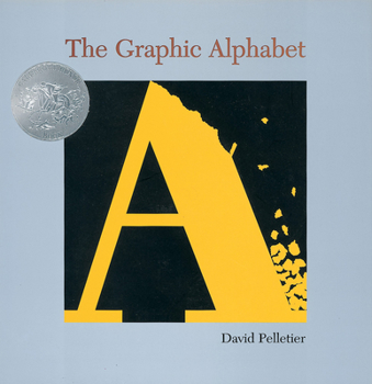
Discover a creative view of the alphabet, in this Caldecott Honor-winning picture book. A graphical representation of the alphabet gives a new view of the letters, from the A that crumbles as an avalanche approaches to the D that glows with the light of the devil.
Format:Hardcover
Language:English
ISBN:0531360016
ISBN13:9780531360019
Release Date:September 1996
Publisher:Scholastic Inc.
Length:32 Pages
Weight:0.92 lbs.
Dimensions:0.4" x 9.8" x 9.9"
Age Range:4 to 8 years
Grade Range:Preschool to Grade 3
Customer Reviews
6 ratings
Great condition
Published by Laura Green , 4 years ago
Awesome quality and described as said
ELLs
Published by Thriftbooks.com User , 15 years ago
Ideal for teaching the alphabet to older beginner ELLs learning the sounds and letters of English. The words for each letter lend themselves to TPR.
The Graphic Alphabet
Published by Thriftbooks.com User , 17 years ago
Pelletier, David. The Graphic Alphabet. New York: Orchard, 1996. ISBN: 0-531-36001-6 Award: Caldecott Honor Book The Graphic Alphabet by David Pelletier is a book that I will definitely suggest to art teachers. What has been done with each letter is phenomenal. It kept my attention as an adult just by the design of the letters, contrast of the vibrant colors and motion or actions the letters themselves suggested. Art deals with the use of line, space, color, shape, perspective and texture. On each page of this book many of these aspects are being addressed, if not all. The letters seem to be 3 dimensional because of the design and colors used. Motion is suggested by the placement of some of the letters, i.e. the y is placed on its side as if it were yawning. The "B" bounces and is made by using a ball. The text used with the "y" is "yawn". The reader can see tiny teeth inside the mouth. Motion and movement are also suggested by the way the lines of the letters are drawn, circle, curl, etc. The "H" is placed over a dark sky with the word "hover" used as the text. The perspectives of this book are clearly for an older student rather than an elementary child. The pictures are glossy which add to the vibrant and dramatic color aspects of the book. Some of the letters seem to have texture, even though they do not. It is an illusion. I found this book intriguing to say the least.
A witty alphabet book
Published by Thriftbooks.com User , 20 years ago
In an epilogue to his 1997 Caldecott Honor Book The Graphic Alphabet, David Pelletier explains his aim: "the illustration of the letterform had to retain the natural shape of the letter as well as represent the meaning of the word." The letter does not simply stand for the word, it becomes the word. So, a "D" represents the devil, by resting on its round side with serifs accentuated into horns; three "O"'s hang from strings as ornaments; "X" is represented in an x-ray image of crossed finger-bones. Each of the letters receives one page, on which the letter appears within a black box, with the word it represents printed below. The bright colors against the black background give the illustrations an intense and dramatic mood, with a sharp quality; the glossy paper plays up the clean lines of the work. Some of the illustrations are obscure and the letters so altered and distorted as to be unrecognizable; sometimes the illustrations seem a bit like an exercise for a graphic design class and not an instructional tool. This book is certainly not appropriate for making the concept of letters concrete for young children, though children who are newly able to recognize letterforms may appreciate extending their knowledge with this book.
Not just for little ones
Published by Thriftbooks.com User , 23 years ago
I wondered how could an alphabet book win a Caldecott Honor. I examined this book with my class of 10 year olds. They loved it and it inspired them to write their own. This book isn't just for little ones learning their alphabet!
A for Apple? Not any more!
Published by Thriftbooks.com User , 27 years ago
I'm torn! Is this a children's book or something I put on my coffee table? It's that good! Instead of cute pictures in bright colors representing letters, Pelletier takes a graphically unusual look at the alphabet using everything from color and graphic images to different varnishes to get across his message. The colors are bright with a black background that jump off the page. The unique images are clever and engaging. One of my favorites is the x-ray of a hand with crossing fingers for X. Have a child; know someone who does; looking for something interesting as an ice breaker? Take a look at this book!


