Skip to content
Scan a barcode
Scan
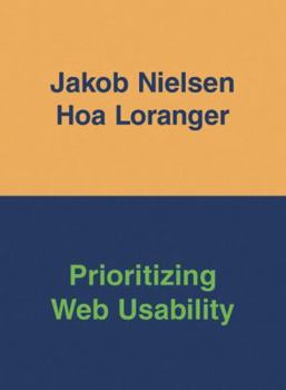
Paperback Prioritizing Web Usability Book

ISBN: 0321350316

ISBN13: 9780321350312

Prioritizing Web Usability

Select Format

Select Condition ThriftBooks Help Icon

Recommended

Format: Paperback

Condition: Very Good

$5.89
Save $49.11!
List Price $55.00
Almost Gone, Only 3 Left!

Book Overview

In 2000, Jakob Nielsen, the world's leading expert on Web usability, published a book that changed how people think about the Web--"Designing Web Usability" (New Riders). Many applauded. A few jeered.... This description may be from another edition of this product.

Customer Reviews

4 ratings

THE best there is

If more businesses read this, they'd have better web sites. And the rest of us wouldn't have to put up with their poorly designed, often unusable web site. If you do business online, hope to do business online, or have any connection with doing business online, you probably need this book. What to do, what not to do, and why. If you can only afford 1 book, make it this one. It'll save you from making a ton of mistakes, and is worth the price.

Don't assume - get the facts, start here!

I started out reading Jakob's first book "Designing Web Usability" way back in 2000. I was a budding web designer and wow! his book gave me a totally new perspective. I read it cover to cover in one day - and then again, and again, because it was chock full on new information that I hadn't found anywhere else. It changed the way I created Websites and talk to my clients ever since. This was a must read then. When "Homepage Usability 50 Web sites deconstructed" (Jakob Nielsen/Martin Tahir) came out in 2000 I wanted to know where I fit in. It was fascinating how these two looked at sites that at first glance I thought were just fine and then they went to work and bit by bit take them appart, analysed them and finally, 19 comments later, informed you about what you have missed and could still improve on. Yikes! I knew I had to pay close attention to this if I wanted to become a great web designer. "...50 Web sites..." is still a great source of inspiration and information to me to this date. So, when "Prioritizing Web Usability" came out, the follow up to "Designing Web Usability", I ordered it right away. This book provides insights that are invaluable to anybody that is starting out as a web designer and web developer. Don't even think you know your users. Don't assume - get the facts, start here. Sure, some things may not surprise you, after all, we too, the users, have become better at using the Internet since 2000 (lightyears away really for anybody working in this business). But this book is chock full of many interesting facts, insights and tips. I boldly say "if you don't read this book you can't be serious doing business on the Web." Read it and then apply it, eventually it will find a warm place in your library. I love this book because it confirms many things that I thought I know but just wasn't sure about it or couldn't put it in the exact context. Most useful to me is chapter 2 'WEB USABILITY' and the findings on Search Dominance, Chapter 5 'SEARCH' and Chapter 8 'WRITING FOR THE WEB' - a concept that is still difficult to grasp for many of my clients. I often give them the "two sentence test", or "elevator speech" test as someone else calls it, with always the same results - they don't want to believe it. It's nice to have Jakob in the wings to back me up :) I can also recommend "Don't Make Me Think!" by Steven Krug - again, great insights in web usability. Overall, this is a book not to be missed. This is a must read now.

Web usability book of the year 2006! No more excuses. Use it!

Ten years ago, the Web was exciting to people. Today it's routine. It's a tool. If it's convenient, they will use it; if not, they won't. Users are getting less tolerant of difficult sites, so every design flaw means lost business. Thus, usability has more more important than ever. This is the introduction of the reviewed book and I fully agree that it is time we prioritize Web usability. Of course, we all know about the fact that usability is important, but are we only paying lip service to the issue. When we decide between great design and great us-ability issues there's is often a trade-off. How often do we accept a lower level of usability in order to show off cool design? By the way, it is not that difficult to measure: Can people use the site at all? Test it! Author Jakob Nielsen has a world-class reputation as Web usability expert since 1995 and this book co-authored by Hoa Loranger proves that he is still going strong. A "practice of simplicity" has always been characterizing Jakob Nielsen's approach to us-ability. A picture is worth a 1000 words and thus the authors has filled this book with new screen shots that show what design mistakes we should avoid. The authors' visualizing and keeping it simple approach makes this book very easy to digest. If you have your own Web site you probably cannot help browsing your own web site to find design mistakes. After having read this book with a huge number of best practices, why do you still need to do your own user testing? The reason is because usability guidelines are based on three levels of research: * general guidelines: user behaviour across most web sites * specialized guidelines: findings about specific genres or areas of sites (such as e-commerce usability or e-government services) * specific guidelines: detailed findings about a specific site and its customers This book only deals with the general guidelines. They may solve 50-80% of your usability problems, but to become best-in-class you need to go all the way to the specific guide-lines. I like Nielsen's $200 user test. It makes it accessible for anybody. No more excuses. Pick 3-4 people in your target group. Give them some specific tasks for your web site. Then observe. Discover what users actually do, not what they say they do (via questionnaires, etc.). So observe, don't survey. Discuss what you have learned and make the changes. Test again, if need be. It's simple, it is cheap, and it is fast. Use.it! I have always been very inspired by Nielsen's manifesto for usability. But beware. He may be a little radical in his approach to usability (although seemingly less so as he matures!). For instance, I always found the design of his own Web site awful. It is very usable obvi-ously, but .... To me it just proves the fact that all Web site owners have to find their own right balance between cool design and great usability. I also recommend Steve Krug's easy-to-read "Don't make me think", and McGovern's books on Web Content. I

The Standard on Web Usability

This is the updated version to Jakob Nielsens "Designing Web Usability : The Practice of Simplicity" which came out back in 1999. That book was one of the first books of its kind in reviewing how users view the web and how web designers should create web pages. This book updates many of his guidelines to the current web. This book starts out (Chapter 1) giving a brief explanation of how the testing was done (69 users around the world), and what websites were included in the tests. Each user was given various tasks to accomplish for each web site and was studied on how they accomplished each task. It then focuses on the importance of user testing on web sites. Personally, I've always felt that unless the website is a large commercial type site (e-commerce), user testing was a waste of time and money. Boy was I wrong... The next chapter is honestly the best in my opinion because it gives lots of great information on how users look at a website and how long they will give until the move on to another. People that don't design websites really don't realize how little time they have to grab the user's attention so they will use the site and come back to it over and over again. Jakob talks about the importance of your homepage and the average time users spend on it (25-35 seconds) and what can be done to improve the user experience. Then website page snapshots are shown on how users read web pages content. People don't actually read entire web pages content, they scan it. I never knew that... The rest of Chapter 2 talks about the importance of Search Engine results and how many pages users will go through in order to find what they are looking for (trust me it isn't a lot). I learned more in reading this chapter than I have in years of web design and surfing. You could buy the book solely on this one chapter. The rest of the book focuses on updating prior usability findings, rating the problems of user failure, navigation and information architecture, readability with typography, writing content, providing good product information, and presenting page elements. The book is only 390 pages, and it seems that you can read it in a day, but believe me; this book has more useful information that books twice its size. This is definitely a book you need to read in parts and really let the information sink in and try to compare the results with websites you have created (I have). Each chapter has tons of screenshots of the various websites that were tested in visually showing you where the problems occur. This is a great practically web book, that it should be in your library no matter what level of web designer/developer you are... Great book....
Copyright © 2024 Thriftbooks.com Terms of Use | Privacy Policy | Do Not Sell/Share My Personal Information | Cookie Policy | Cookie Preferences | Accessibility Statement
ThriftBooks® and the ThriftBooks® logo are registered trademarks of Thrift Books Global, LLC
GoDaddy Verified and Secured