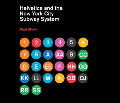
Helvetica and the New York City Subway System: The True (Maybe) Story
How New York City subways signage evolved from a "visual mess" to a uniform system with Helvetica triumphant. For years, the signs in the New York City subway system were a bewildering hodge-podge of lettering styles, sizes, shapes, materials, colors, and messages. The original mosaics (dating from as early as 1904), displaying a variety of serif and sans serif letters and decorative elements, were supplemented by signs in terracotta and...
Format:Hardcover
Language:English
ISBN:026201548X
ISBN13:9780262015486
Release Date:February 2011
Publisher:MIT Press
Length:144 Pages
Weight:0.60 lbs.
Dimensions:0.8" x 11.3" x 9.7"
Age Range:18 years and up
Grade Range:Postsecondary and higher
Related Subjects
DesignCustomer Reviews
0 rating


