Skip to content
Scan a barcode
Scan
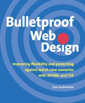
Paperback Bulletproof Web Design: Improving Flexibility and Protecting Against Worst-Case Scenarios with XHTML and CSS Book

ISBN: 0321346939

ISBN13: 9780321346933

Bulletproof Web Design: Improving Flexibility and Protecting Against Worst-Case Scenarios with XHTML and CSS

Select Format

Select Condition ThriftBooks Help Icon

Recommended

Format: Paperback

Condition: Like New

$6.09
Save $33.90!
List Price $39.99
Almost Gone, Only 1 Left!

Book Overview

No matter how visually appealing or content-packed a Web site may be, if it's not adaptable to a variety of situations and reaching the widest possible audience, it isn't really succeeding. In... This description may be from another edition of this product.

Customer Reviews

4 ratings

A must for any web developers library!

Bulletproof Web Design does an incredible job of teaching, step-by-step, how to make your website `Bulletproof.' The author introduced the book by defining what it means to have a bulletproof website. He used the example of a police officer wearing a bulletproof vest. No, it is not 100% protection against a bullet - but it decreases the chances and is extra protection. When applied to a website, this means that your website can handle the `bullets' being thrown at it. These are things like text resizing, use of assistive devices, no CSS, no images, and a few other examples. The thing I liked most about this book is that it wasn't preaching web standards - It was simply walking you through each chapter - with each chapter building on the last - and showing you techniques that WORK. The book itself does an incredible job of keeping your attention through the use of images, highlighting, and full code listing. For those who can't quite grasp CSS (especially positioning and the like), this book is extremely helpful through its thorough explanations and visuals. Screenshots are provided each step of the way to let you see your progress. Each chapter introduces you to new ways of handling things like text display, link display, navigation, list elements, layouts, floating, positioning, and a few others. Each chapter first take an example of a website (or aspect of a website) that is NOT bulletproof, then re-constructs that example with semantic XHTML and CSS to show you the results. The last chapter of the book brings it all together and shows you how it could be used in a production environment, with each piece of the puzzle being put together. The author doesn't dwell on the array of hacks and filters - but simply lists the ones that he uses and how they get the job done (and why they are needed). Using proper XHTML and CSS is sometimes misunderstood. This is where many will start with a bad case of classitis and divitis and start going crazy adding extra markup. The author does a great job of creating very lean, structured, semantic XHTML. This is the XHTML that is friendly to browsers and other devices alike, as well as rich in meaning. Using proper elements to get the job done is vitally important to the meaning of the website itself. He focuses on this aspect, and with each chapter discusses the importance of the structure and not adding unnecessary presentational markup to your pages. It is this separation of presentation and content that ultimately makes using proper CSS a wise choice. Quite frankly, this is one of the best CSS books I have read - and would recommend it to both the beginner and advanced CSS developer. This review doesn't even do the book justice - mainly because you need to buy it and read it to really enjoy the context as a whole. There are many things I could explain in more detail, and there are many different things that I learned through reading this book (some of which were things that were needed immediately). This i

Great ideas

Simply put, I like Dan's approach. I have attempted all of the ideas he presents in this book and they've all rendered properly in IE6, Mozilla 1.03, and Opera 8.5. I haven't tried the examples in legacy browsers such as Netscape 4, which apprently bungles CSS to bits. He claims it works in those browsers... and I believe him. His ideas allow users (site visitors) to resize their text without distorting page layout - bottom line. I've tested that as well. Remember the days of table based layout. If a user chose to increase his font size, tables would stretch and the integrity of the layout would be severly compromised. Not with Dan's approach. Your text stays contained within it's elements, because the elements adjust to the font size of the text they contain... pretty nifty. More importantly, his layouts display properly in text based browsers because of proper use of semantic markup. Same goes for palm pilots, and other non-traditional methods of viewing web pages. In simple terms, his ideas meet the standards of the Web Accessibility Initiative. Remember not being able to view javascript menus of yesteryear, because javascript was disabled... forget about it... no need to write javascript menus anymore, because CSS can handle all of those fun mouseover-type effects for you (if javascript is your bag, I would recommend Jeremy Keith's book - DOM Scripting). OK, that's should probably do it.

The most useful Web design book I've ever owned

I'm a Web designer for one of the big three office supply chains in the US. This book is never more than an arm's reach away from my workstation, and I consult it almost daily. Unlike other XHTML/CSS books that examine what's theoretically possible, Cederholm's book focuses on foolproof solutions to common Web design issues. It is engagingly written and beautifully lain out. With this book and a basic knowledge of CSS, you'll be creating pages that not only look great, but make the Web a better place. This is the new Web bible. Buy it, read it, live it.

This book is the one

If you are just coming over the the standards-compliant light, this book is the best for showing real, working techniques. Great examples that work. A cookbook. Cederholm won my heart and my mind with "Web Standards Solutions" and this book builds on that theme. The man is a good writer, easy to understand, and he makes compelling and lucid points. Cederholm's presentation is great: he states a problem or goal, then examines several different ways of solving it. The examinations are just a paragraph or two long -- short and to the point. He points out the strengths and weaknesses of the various solutions, then concludes with a "best practices" solution. Finally, he builds on and refines the best practices solution to deliver a finished piece. When there is no clear-cut best way, he lays the cards on the table and let's you decide what is best for your specific application. He talks about the compromises between pixel-perfect layouts and fluid layouts and how each effects design and useability issues. It is not stand-alone because a good reference is still useful to have by your side.
Copyright © 2024 Thriftbooks.com Terms of Use | Privacy Policy | Do Not Sell/Share My Personal Information | Cookie Policy | Cookie Preferences | Accessibility Statement
ThriftBooks® and the ThriftBooks® logo are registered trademarks of Thrift Books Global, LLC
GoDaddy Verified and Secured